Page 59 - Preview-copy-Online-Marketing-English
P. 59
Preview copy
    19


                 CHAPTER 19


            19.  Mobile marketing


            The use of mobile devices such as smartphones and tablets has increased significantly in recent
            years. Almost everyone uses the smartphone or tablet for searches and social media. The use
            of smartphones and tablets by companies will, however, be lower than by private individuals.
            This increased use affects the way Google ranks web pages that are requested with a mobi-
            le phone. These pages can only be ranked if they are easy to read and use on a mobile device.
            This means, for example, that the font size should be large enough and that the "article ele-
            ments" (the links) should not be too close to each other. The pages should also scale well from
            large to small.


            19.1  Mobiele websites


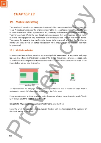
            In order to realize the above, websites are nowadays built "responsive". A responsive web page
            is a page that adapts itself to the screen size of the device. The various elements of a page, such
            as text blocks and navigation buttons are automatically shifted when the screen is small. In the
            image below we see how this works.


                                                                                    Mobiel
                                                             Tablet
                               Desktop
            The information on the web page is scaled according to the device used to request the page. When a
            web page is requested, the hosting server recognizes the device used.


            Every website owner and marketer can easily determine whether the web site is mobile friend-
            ly by carrying out the "mobile friendly test".

            Navigate to: https://search.google.com/test/mobile-friendly?hl=nl


            Enter the url of the page to be tested. We ran this test with the homepage of the publisher of
            this book. Below is the result:


           156

